So how does one look for bad design? Sometimes it finds you. And sometimes you have to go out and look for it. As I was thinking about where I could find poorly designed websites, a few categories came to mind. The first was Poconos' Time-Shares sites. I think Poconos and I think tacky. Probably because of years of exposure to those commercials featuring people in tubs that looked like champagne glasses. Plumbing and heating companies and real estate websites would also provide material I was sure. And church sites (while it may not be advisable to go there, I figure I'm probably going to hell for other reasons anyway so what does it matter). The potential was there. The results did not disappoint.
The visual offenders will be exposed soon.
Friday, March 25, 2011
Saturday, March 19, 2011
Just Asking For It
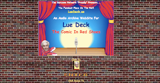
This site is obeying the unwritten law that a comic must use Comic Sans typeface. Science has proven that anything written in Comic Sans is automatically funny. So please do use it with caution. I do find Lue Deck's site very funny, but not in a good way. I am definitely laughing at him and not with him. The animated gif of his disembodied head on sneakers walks back and forth across the screen. I'm not kidding. The site also has an "enter" button even though the homepage scrolls down for an amazing length of time. There is no need to have an "enter" button and it's advisable not to use one. Visitors' have a very short attention span and they will not waste their time clicking past an opening page. You get one shot for a few seconds and if you don't hold their attention or they don't see what they're looking for they are gone. Usually for good. Sorry Lue, time to get off the stage.
Monday, March 14, 2011
Red Does Not Mean Stop
Their motto is "cheap everyday." That seems to apply to their website design as well. What can you make me for a quarter? That's great! To the Internet! There's also a lack of excitement to this site. How about a photo or even an illustration of some kind? There's just a scattering of a few logos to distract you from the bright red boxes. It's difficult to tell what this company does, or what it wants a potential customer to do once they are here. There also doesn't seem to be any type of navigation. Hopefully, there's no need to move beyond the landing page.
No Sale
A rich source of bad designs are real estate websites. I'm not sure why that is. Considering it's all about "curb appeal" and "staging" you would think a business that puts so much emphasis on visual aspects would put more care in their web presence. I see what they were going for with the brick background. And the doorknob and the house image. Along with all the other images of actual homes. They really want you to know they sell real estate. I get it.
Let's talk about the logo briefly. It's bad. Courier font with over-lapping letters. Lame. And there's a misspelling, "ovelooking." I love that feature in any property. This balcony "ovelooks" a charming garden. Sloppiness like this makes me take my business elsewhere.
Let's talk about the logo briefly. It's bad. Courier font with over-lapping letters. Lame. And there's a misspelling, "ovelooking." I love that feature in any property. This balcony "ovelooks" a charming garden. Sloppiness like this makes me take my business elsewhere.
Saturday, February 19, 2011
Welcome! Again...
We have all come across websites that suffer from poor self-esteem and neglect. Looking for validation with their garish colors, mixed fonts and lack of cohesive design sense. A visual assault on the sense of unsuspecting viewers. I track them down, try to rehabilitate if possible and share them with you.
Where does it go wrong? Let us count the ways...
Where does it go wrong? Let us count the ways...
Today's Offender
This caught my attention because it's an article discussing graphic design on the Web. Surely, these people know what they are talking about. I'm certain that it was their intention to have the spiral notebook image appear in the middle of the article. I guess someone didn't understand that a background image repeats to fill the size of the screen. Maybe there's a chapter on that in the article.
The spiral notebook graphic makes me think of high school. I guess they are trying to look academic. Doesn't quite do it for me. Maybe I need a denim covered binder graphic instead.
Breaking All the Rules
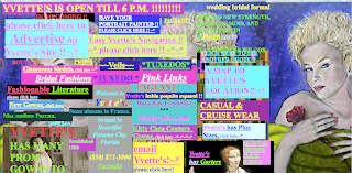
This website decided to break every design rule out there and not in a good way. Under Advice, I give some simple guidelines on how to approach website design and what to avoid. This site manages to go against almost all of those guidelines. I think it's best to use a limited color palette, but not this site. It looks like a box of 64 crayons melted on the screen. Don't look too long or the image may burn onto your retinas. What else shouldn't you do that this site does in reckless abandon? How about have annoying music? Check! They do give you the option to mute the music, as long as you are willing to endure a visual assault to find it. Too much information? Check! I can't imagine how they could possibly cram any more links on to there main page is a more confusing manner. Yet despite all the links, it's extremely difficult to figure out what this is a website for. It's a bridal store in case you are wondering. They also have a very annoying animated gif that consists of a big multi-colored square that turns into a face and back again traveling all around the edge of the screen. I don't get it.
The only positive thing I can say is thank goodness the designer didn't use Flash.
The only positive thing I can say is thank goodness the designer didn't use Flash.
Subscribe to:
Posts (Atom)


