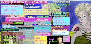
This website decided to break every design rule out there and not in a good way. Under Advice, I give some simple guidelines on how to approach website design and what to avoid. This site manages to go against almost all of those guidelines. I think it's best to use a limited color palette, but not this site. It looks like a box of 64 crayons melted on the screen. Don't look too long or the image may burn onto your retinas. What else shouldn't you do that this site does in reckless abandon? How about have annoying music? Check! They do give you the option to mute the music, as long as you are willing to endure a visual assault to find it. Too much information? Check! I can't imagine how they could possibly cram any more links on to there main page is a more confusing manner. Yet despite all the links, it's extremely difficult to figure out what this is a website for. It's a bridal store in case you are wondering. They also have a very annoying animated gif that consists of a big multi-colored square that turns into a face and back again traveling all around the edge of the screen. I don't get it.
The only positive thing I can say is thank goodness the designer didn't use Flash.


